The hardest place a small business logo ever appears is a thermal printer fifty eight millimetres wide. If it survives that, it survives everything.
When we design a mark for a shop, the test that decides it is not the shopfront. It is the receipt.
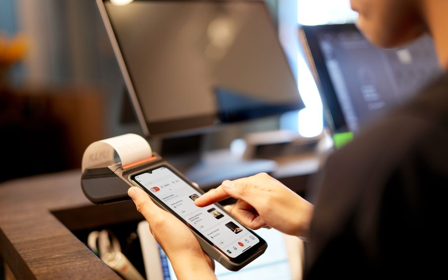
A thermal printer in a small shop prints at low resolution, in one colour, on a roll fifty eight millimetres wide, and the ink it makes is a slightly grey black that spreads. Any fine line disappears. Any two tones of a similar darkness merge into one shape. Any gap smaller than about half a millimetre closes up. A logo that looks beautiful on a screen very often prints on a receipt as an unrecognisable blob, and the shop then stops putting it on receipts, which is a small daily loss of the thing they paid for.
So we print candidates on a real thermal roll early, and it changes the design rather than merely validating it. Strokes get heavier. Two colours that were distinguishable only by hue get separated by tone as well. Counters, which are the enclosed spaces inside letters, get opened up. Detail that was carrying no meaning gets removed.
The useful thing is that a mark which survives a receipt survives everything else automatically. It works embroidered on a shirt, where the needle cannot resolve fine detail either. It works cut in vinyl, where a thin stroke cannot be weeded off the backing sheet. It works at sixteen pixels as a browser icon. It works stamped on a box in one colour. Design for the worst case and the easy cases are free.
The opposite approach is what produces the most common problem we are asked to fix. A logo designed once, at a large size, in full colour, with a gradient and a shadow, delivered as a single image. It looks excellent on the designer's screen and it cannot be used on half the things a shop actually needs. Every supplier then redraws it themselves, and within a year the shop has four slightly different versions of its own mark in circulation.
Which is why a logo leaves this studio as a set rather than a picture: vector originals, a single colour version, a version for dark backgrounds, a horizontal and a stacked arrangement, and a square one. Plus two pages saying which to use where.
If you already have a logo and nobody has ever printed it on a receipt, print it on one this week. It takes a minute and it tells you what you own.